Overview
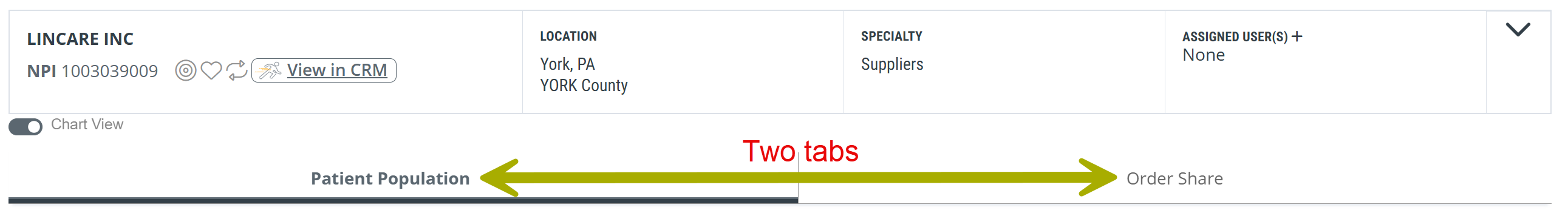
The Billing Organizations Analyze page is where you study a single HME or infusion supplier in depth — your own company, a competitor, or any billing organization in your market. The page is organized into two tabs. The Patient Population tab shows you who the selected billing organization is serving — how many patients, how those patients break down by payer, and how the picture has shifted across recent quarters. The Order Share tab shows you the physicians sending orders to the selected billing organization, how concentrated that physician base is, and the Medicare FFS medical groups those physicians are most affiliated with.
You will find a billing organization's Analyze page by:
- Clicking on a Billing Organization name on the Home page or the Explore page
- Using the Recent Providers icon to return to a recently viewed Analyze page
- Clicking the Analyze button, which opens the most recently viewed Analyze page
 location
There are three ways to navigate to the Billing Organization Analyze page:
- When viewing the Billing Organization Explore page, click on the name of a billing organization in the main table on the page.
- When viewing the Home page, under the Organizations tab, click on the name of a billing organization that is a current favorite listed in the table.
- With the "Recent Providers" dropdown
 open, click on the name of a listed billing organization.
![]() There are two tabs on the Billing Organization Analyze page: Patient Population and Order Share. Details for each tab are included below.
There are two tabs on the Billing Organization Analyze page: Patient Population and Order Share. Details for each tab are included below.
In this Article
Patient Population tab
The Patient Population tab gives you a top-down view of the patients served by the selected billing organization. Two tables anchor the tab. Patient Volume tells you how many patients and how many patient days, across the most recent year and the most recent quarters. Payer Mix tells you how those patients break down by primary payer type.
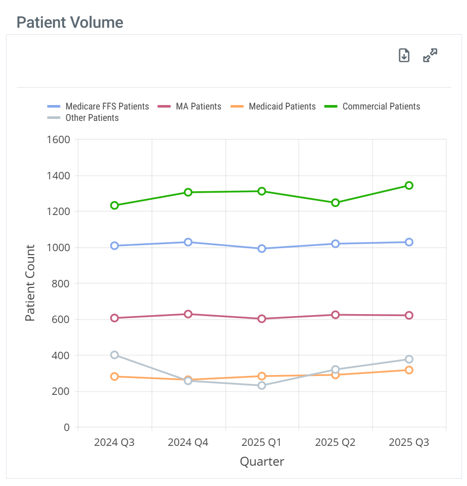
Patient Volume
The Patient Volume content is shown in a chart or table.
Chart View and Table View
 Off Off
|
|
 On On
|
|
|
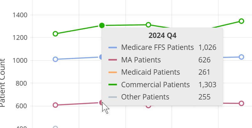
When you hover over a column in the Patient Volume chart, the metrics for the different patient counts represented in that column are displayed. |
|
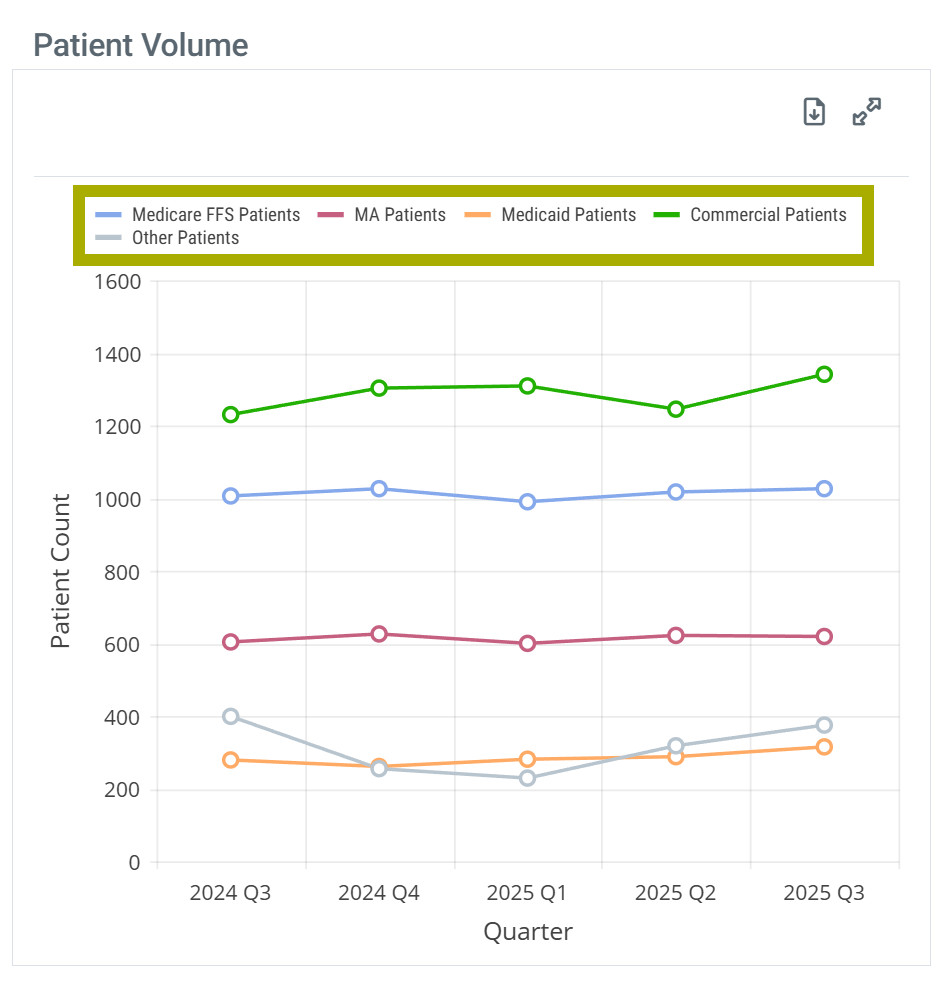
|
With chart view on the Patient Volume chart has a legend that identifies the elements in the chart. Each different identifier in the legend can be toggled on and off to display or hide the matching elements in the chart. Hovering over an identifier highlights the related elements in the chart.
| |
| Chart Legend | Legend Customize |
|
|
|
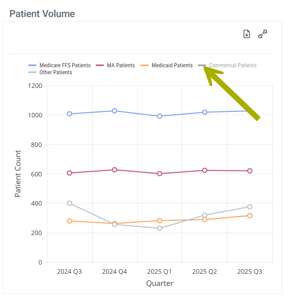
Understanding the Metrics
The table shows patient counts for the most recent year of available data and counts for the most recent quarters. Each row includes metrics for a different set of patients tied to the selected billing organization.
Columns | |
Metric Name |
Description |
| Annual Patient Count (FFS) |
For each row, this column provides distinct patient counts for the most recent year of data available for the listed billing organization.
|
| 20YY QX | For each row, this column displays distinct patient counts for the quarter listed in the header. |
Rows | |
| Medicare FFS Patients |
The count of distinct patients who had a claim attributed to the listed organization NPI for claims billed through Medicare FFS. |
| MA Patients | The count of distinct patients who had a claim attributed to the listed organization NPI for claims billed through Medicare Advantage |
| Medicaid Patients | The count of distinct patients who had a claim attributed to the listed organization NPI for claims billed through Medicaid |
| Commercial Patients | The count of distinct patients who had a claim attributed to the listed organization NPI for claims billed through commercial payers. |
| Other Patients | Estimated count of distinct patients who had a claim attributed to the listed organization NPI for claims billed through an insurer other than traditional Medicare FFS, Medicare Advantage, Medicaid or a commercial plan during the specified quarter. Other patients consist of VA, Tricare, workers comp or unknown payers |
 Putting the Data to Work
When you sit down to size a territory or evaluate an account, Patient Volume answers the first question that matters: how many patients does this billing organization actually touch, and is that count growing or shrinking? A billing organization with a flat patient count over four quarters is a different conversation than one trending up 20% — both are worth your time, but for different reasons. The Annual Patient Count column gives you the trailing-year baseline; the quarterly columns tell you whether the trend is your friend.
![]() A steady patient count combined with a strong Medicare FFS share usually points to a stable, contract-driven account. A volatile patient count usually points to a referral-driven account where physician relationships are the leverage point.
A steady patient count combined with a strong Medicare FFS share usually points to a stable, contract-driven account. A volatile patient count usually points to a referral-driven account where physician relationships are the leverage point.
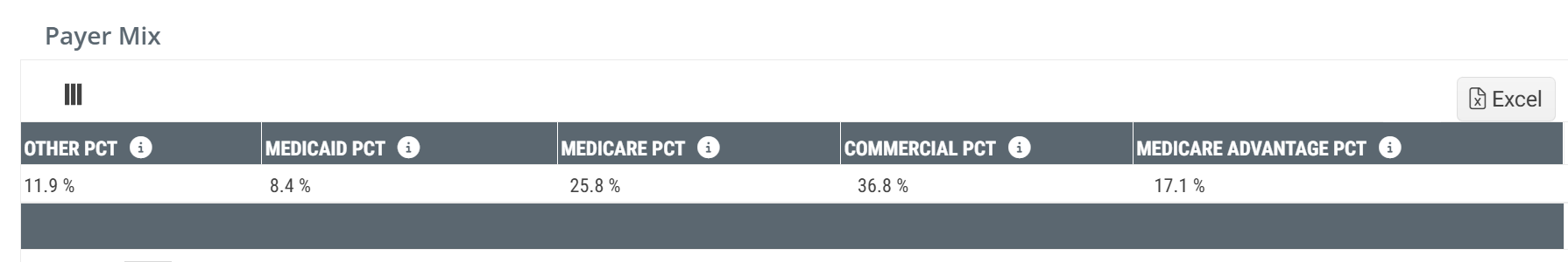
Payer Mix
The Payer Mix content is shown in both a table and a chart view.
Chart View and Table View
|
Off
|
|
|
On
|
|
|
When you hover over a sector in the Payer Mix chart, the metrics for the chosen sector is shown and the remaining sectors are lightened. |
|
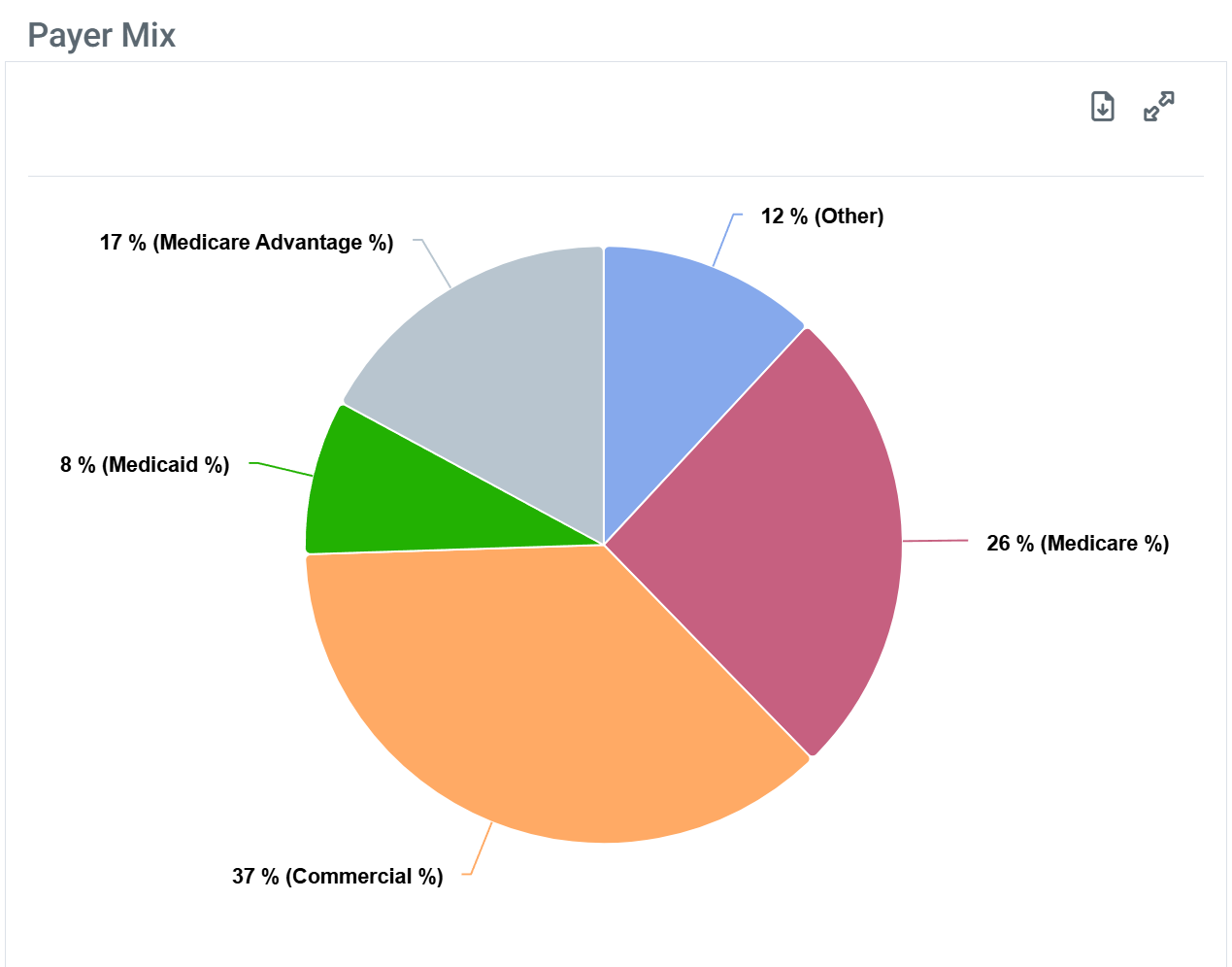
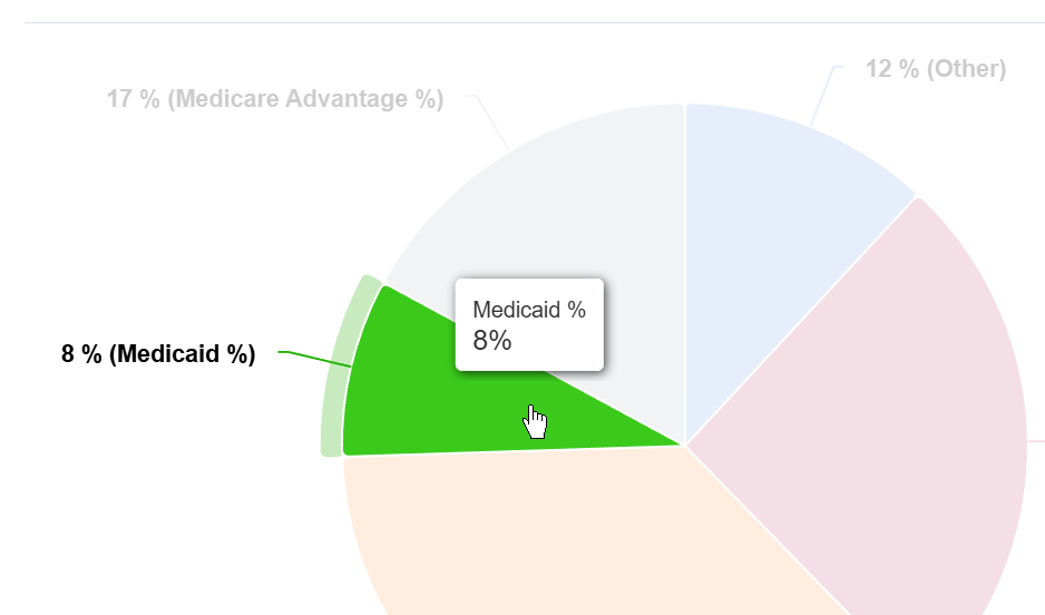
| The Payer Mix chart does not have a legend. |
Understanding the Metrics
The Payer Mix table shows the percentage of the selected billing organization's patient population covered by each primary payer type, across the most recent year and the most recent quarters.
Columns | |
Metric Name |
Description |
| Medicare Pct | The percentage of patients for the selected billing organizations within the one-year reporting period who had Medicare FFS claims. |
| Medicare Advantage Pct | The percentage of patients for the selected billing organizations within the one-year reporting period who had Medicare Advantage claims. |
| Medicaid Pct | The percentage of patients for the selected billing organizations within the one-year reporting period who had Medicaid. |
| Commercial Pct | The percentage of patients for the selected billing organizations within the one-year reporting period who had claims from a commercial provider. |
| Other Pct | The percentage of patients for the selected billing organizations within the one-year reporting period who had claims with any of the following: worker's compensation, state payments, PBM, cash, union payments, employee RPDP and unspecified/unknown payers. |
![]() Payer percentages reflect Trella's full multi-payer claims dataset. The percentages will sum to roughly 100% across the five payer categories for any given period.
Payer percentages reflect Trella's full multi-payer claims dataset. The percentages will sum to roughly 100% across the five payer categories for any given period.
Putting the Data to Work
Payer Mix tells you which payers actually drive the selected billing organization's revenue, which shapes how you approach the account. A billing organization with a heavy commercial mix is contracting-conversation territory — pricing, payer relationships, and authorization workflows matter most. A billing organization with a heavy Medicare FFS or Medicare Advantage mix turns the conversation toward referrer relationships, code set strategy, and claim economics. Watch for shifts across quarters: a moving payer mix often signals a strategic move at the account, not a data anomaly.
Order Share tab
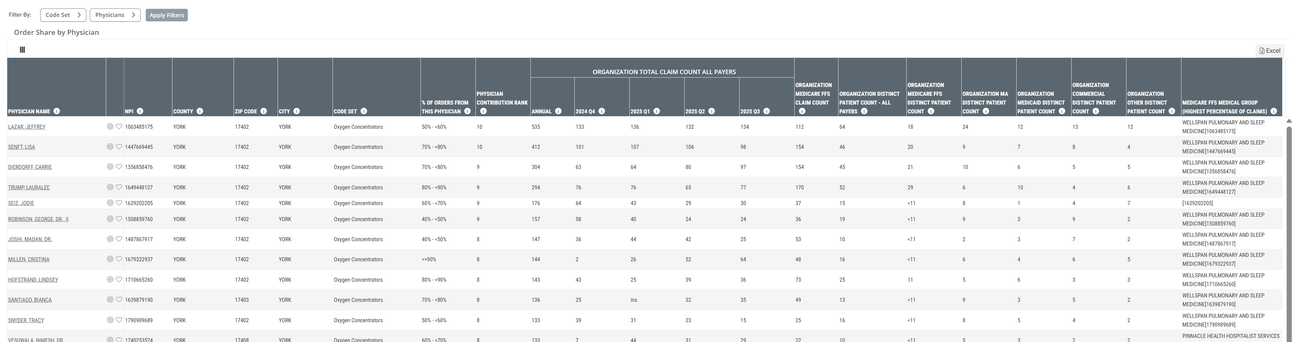
The Order Share tab tells you where the selected billing organization's order volume actually comes from — physician by physician. Each row in the table is one physician sending orders to the selected billing organization, with rank, share, claim counts, distinct patient counts by payer, and the Medicare FFS medical group that physician is most affiliated with.
Order Share by Physician table
When you click on the Order Share tab, the following table is displayed.
![]() Click on the above image to enlarge it.
Click on the above image to enlarge it.
Filters
There are two filters available for the Order Share by Physician table that allow you to limit what is shown in the table. They are visible above the table on the left side.
Filter Name |
Image |
Code SetUse the Code Set dropdown to choose which code sets you want represented in the table.
|
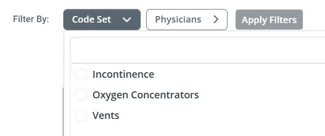 |
PhysiciansThe Physician dropdown filter allows you to choose any number of physicians to be displayed in the table.
|
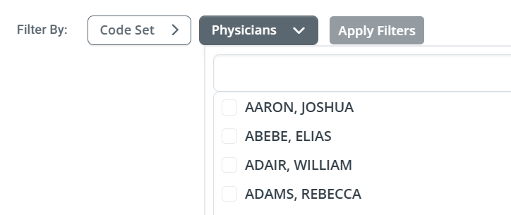 |
Understanding the Metrics
The Order Share by Physician table is one row per physician, sorted by contribution to the selected billing organization's order volume. The columns walk from physician identity through share, claim and patient counts by payer, the most-affiliated Medicare FFS medical group, and per-quarter detail.
Columns | ||
Metric Name |
Description |
|
| Physician Name | The name of the physician sending orders to the selected billing organization. The name links to the physician's Analyze page. | |
| NPI/County/ZIP Code/City | The physician's 10-digit National Provider Identifier. The County/ZIP Code/City of the physician's primary practice address as recorded in the NPPES registry. | |
| Code Set |
The HME code set the physician's orders for the row fall under.
|
|
| % of Orders from this Physician | The percentage of the physician's orders or prescriptions within the listed code set that were fulfilled by the selected billing organization | |
| Physician Contribution Rank |
The physician's ranked volume of orders for the listed organization; with a rank of 10 being the highest. |
|
| Organizational Total Claim Count All Payers | Annual | Sum of estimated claims filed with the listed organization NPI and physician NPI for all claims billed during the most recent 12 months for the listed code set. The purpose is to quantify the claim volume for the listed code set where the listed organization was either the billing organization or likely influenced the supply based on Trella's algorithm. |
| 20YY QX | Sum of estimated claims filed with the listed organization NPI and physician NPI for all claims billed during the quarter identified in the header for the listed code set. | |
| Organization Medicare FFS Claim Count | The count of estimated claims filed with the listed organization NPI and physician NPI for claims billed through Traditional Medicare FFS during the most recent 12 months for the listed code set. The purpose is to quantify the Traditional Medicare FFS claim volume for the listed code set where the listed organization was either the billing organization or likely influenced the supply to the physician based on Trella's algorithm. | |
| Organization Distinct Patient Count - All Payers | The estimated count of distinct patients who had a claim filed with the listed organization NPI and physician NPI for claims billed through any payer (Medicare FFS, MA, Medicaid, Commercial, Other) during the most recent 12 months for the listed code set | |
| Organization Medicare FFS Distinct Patient Count | The estimated count of distinct patients who had a claim filed with the listed organization NPI and physician NPI for claims billed through Traditional Medicare FFS during the most recent 12 months for the listed code set. The purpose is to quantify the Traditional Medicare FFS distinct patient count for the listed code set where the listed organization was either the billing organization or likely influenced the supply to the physician based on Trella's algorithm. | |
| Organization MA Distinct Patient Count | The estimated count of distinct patients who had a claim filed with the listed organization NPI and physician NPI for claims billed through Medicare Advantage during the most recent 12 months for the listed code set. The purpose is to quantify the Medicare Advantage distinct patient count for the listed code set where the listed organization was either the billing organization or likely influenced the supply to the physician based on Trella's algorithm. | |
| Organization Medicaid Distinct Patient Count | The estimated count of distinct patients who had a claim filed with the listed organization NPI and physician NPI for claims billed through Medicaid during the most recent 12 months for the listed code set. The purpose is to quantify the Medicaid distinct patient count for the listed code set where the listed organization was either the billing organization or likely influenced the supply to the physician based on Trella's algorithm. | |
| Organization Commercial Distinct Patient Count | The estimated count of distinct patients who had a claim filed with the listed organization NPI and physician NPI for claims billed through a Commercial plan during the most recent 12 months for the listed code set. The purpose is to quantify the Commercial plan distinct patient count for the listed code set where the listed organization was either the billing organization or likely influenced the supply to the physician based on Trella's algorithm. | |
| Organization Other Distinct Patient Count | The estimated count of distinct patients who had a claim filed with the listed organization NPI and physician NPI for claims billed through an insurer other than Traditional Medicare FFS, Medicare Advantage, Medicaid or a Commercial plan during the most recent 12 months for the listed code set. The purpose is to quantify the Other distinct patient count for the listed code set where the listed organization was either the billing organization or likely influenced the supply to the physician based on Trella's algorithm. Other patients will typically consist of VA, Tricare, Workers Comp or Unknown payers. | |
| Medicare FFS Medical Group (Highest Percentage of Claims) | Medicare FFS Medical Group (Billing NPI) for which the listed physician had the highest percentage of claims in the most recent year. | |
![]() Provider address data (County, ZIP Code, City) reflects the physician's primary practice address as recorded in NPPES. NPPES updates flow into Trella on a quarterly cadence, so a recently relocated physician may show a stale location until the next update.
Provider address data (County, ZIP Code, City) reflects the physician's primary practice address as recorded in NPPES. NPPES updates flow into Trella on a quarterly cadence, so a recently relocated physician may show a stale location until the next update.
![]() For more on the NPPES, see Using the NPPES NPI Database Search.
For more on the NPPES, see Using the NPPES NPI Database Search.
Putting the Data to Work
Order Share by Physician is the targeting layer for HME and infusion sales. Three patterns to look for: concentration, affiliation, and direction.
Concentration — if the top three or four physicians account for 40%+ of the selected billing organization's orders, those physicians are the account. Win them or you do not have the account.
Affiliation — the Medicare FFS Medical Group (Highest Percentage of Claims) column tells you which medical group each physician is most embedded in. When the medical group lines up with the selected billing organization's name, that physician is almost certainly billing through the organization itself rather than ordering across to it. When the medical group is a different practice, the physician is an ordering relationship — and a competitor's most likely target.
Direction — watch the quarterly columns. A physician trending up across the four quarters is a relationship strengthening. A physician trending down is a relationship cooling, often before the contract data shows it.
Common questions
Three or four questions tend to come up the first time a user works through this page. The answers all come back to one idea: HME and Infusion data is built from claims that are sometimes incomplete, and Trella fills the gaps with careful inference rather than leaving them blank. Here's what's worth knowing.
 Why are these counts described as "estimated"?
Because not every claim arrives with all of its identifying fields filled in. A meaningful share of HME and Infusion claims reach Trella missing the referring physician's NPI, the billing organization's NPI, or both — usually because the source that supplied the claim is required to strip those fields before sharing. Rather than discard the claim, Trella's data science team applies a careful imputation process to fill in the most likely missing values. The resulting counts are designed to be directionally correct — close enough to drive real targeting and account decisions — without claiming to be exact.
![]() When you see "estimated" in a column header anywhere on this page, this is what it refers to.
When you see "estimated" in a column header anywhere on this page, this is what it refers to.
If a physician appears in the Order Share by Physician table, did they actually prescribe for our organization?
Probably yes — and worth treating as an affiliation rather than a guarantee. In Trella Insights, an order is attributed to a physician when the physician's NPI appears on the claim in any role (referring, rendering, billing, or service-line) or when Trella's attribution logic identifies the most likely referring physician based on the patient's broader claim history. This means a physician in the table is consistently associated with the patient and the order, but the relationship is best read as an affiliation with the listed billing organization for the listed code set — one that often does, but may not always, mean the physician personally wrote the order.
![]() This is why the column is named % of Orders from this Physician rather than % of Prescriptions Written by this Physician. The language is deliberate.
This is why the column is named % of Orders from this Physician rather than % of Prescriptions Written by this Physician. The language is deliberate.
Why don't the patient counts on this page line up with what I see for the same physician elsewhere?
Two reasons, both important.
First, the patient counts on this page are scoped to the selected billing organization and the selected code set. The same physician's patient count on their own Analyze page covers all of that physician's claims, across every code set and every organization they touch. Those are different patient populations by design — the page-level count is a subset, not a discrepancy.
Second, Payer Mix percentages and patient counts answer slightly different questions. Payer Mix tells you the composition of all of a physician's claims; patient counts tell you which patients fall into the specific code set for this organization. The two views will not reconcile to the same totals, and that's expected.
Where does the underlying data come from?
Trella sources HME and Infusion claims from several places. Medicare Fee-for-Service claims come directly from CMS and arrive with the most complete set of data elements. Medicare Advantage, Medicaid, Commercial, and the various Other payer categories come from a combination of payers, clearinghouses, and additional sources — these tend to be the records most likely to arrive with stripped or missing fields, and most likely to need the imputation work described above.
![]() For more on how provider identity fields work in claims data, see Using the NPPES NPI Database Search.
For more on how provider identity fields work in claims data, see Using the NPPES NPI Database Search.